A burn index will tell you a fire happened. It will not tell you precisely how much burned, and left alone it cannot tell a fire from a clearfell.
Nearly every satellite burn map you have seen is built on NBR — the Normalized Burn Ratio. It is the standard, it is genuinely good, and it has four limitations that matter to anyone acting on the output.
We measured all four against Europe's official fire perimeters. This post is the numbers, and what GeoTown does about each one.
How the index works
NBR compares near-infrared light against short-wave infrared. Healthy vegetation reflects a lot of the first and little of the second; burned ground does the reverse. Take the ratio before a fire, take it after, subtract, and the difference — dNBR — maps where that signal collapsed. Above about 0.27 is conventionally moderate severity, above 0.66 high.
That is the whole idea, and it works because fire changes vegetation in a way that is very visible at those wavelengths.
How we checked it
EFFIS, the European Forest Fire Information System, publishes burnt-area perimeters as an open service. It is the reference European agencies use.
For five sites we rasterised the EFFIS perimeter onto the same pixel grid as our own dNBR analysis and compared them pixel for pixel — counting only pixels the satellite could actually see, since scoring a detector on ground hidden by cloud tells you nothing.
| Site | EFFIS burned, in box | dNBR flagged | Recall | Precision | Cloud-free |
|---|---|---|---|---|---|
| Bohemian Switzerland, CZ | 1,233 ha | 662 ha | 0.48 | 0.90 | 75% |
| Sierra de la Culebra, ES | 2,706 ha | 2,784 ha | 0.72 | 0.70 | 82% |
| Central Evia, GR | 1,686 ha | 1,790 ha | 0.66 | 0.62 | 33% |
| Landiras, Gironde, FR | 121 ha | 562 ha | 0.20 | 0.04 | 73% |
| Gironde south-east | 0 ha | 1,290 ha | — | 0.00 | 83% |
Recall is how much of the real fire the index found. Precision is how much of what it flagged really burned. Those two columns are the rest of this post.
Limitation 1 — it delineates roughly
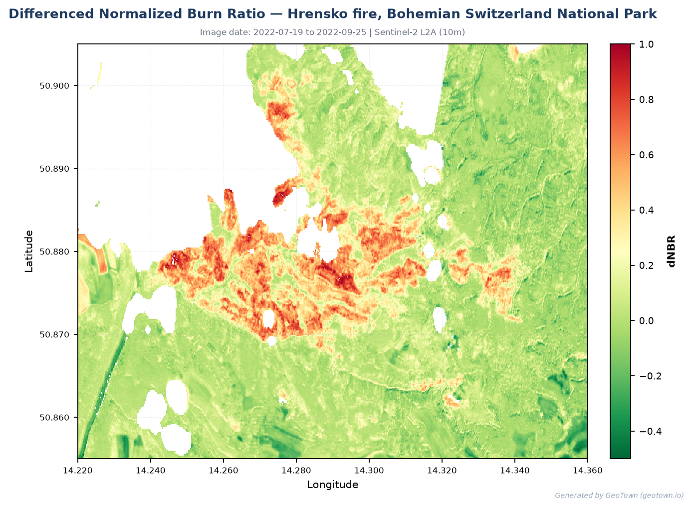 The Hřensko fire, Bohemian Switzerland, July 2022. A convincing scar — and about half the burned area is not in it.
Recall lands between roughly a half and two-thirds. At Bohemian Switzerland the index found 662 of 1,233 hectares.
This is inherent to the approach. Low-severity ground burn under an intact canopy barely moves the signal, because the canopy the satellite sees is still green. Cloud removes whole sections of the record. Any fixed threshold cuts somewhere, and real fires have edges that fade rather than stop.
What we do: report burned area from the burned patches themselves rather than a scene average, and treat the number as a floor. An earlier version of our tool derived severity from the average dNBR across the whole area you drew — which meant any fire covering less than roughly a third of your box vanished into the mean, and a textbook fire scar could be reported as unburned. It now measures pixels above threshold, grouped into connected patches, and reports the burned area, the largest patch and a severity breakdown separately.
What you should do: treat a burned-area figure from any NBR tool, ours included, as a lower bound.
Limitation 2 — it cannot tell fire from harvest
This is the one that catches people.
At Landiras, in the Landes de Gascogne, the index flagged 562 hectares where 121 had burned. Thirty kilometres away, in a control area with no fire at all, it flagged 1,290 hectares — and EFFIS records nothing there in the whole of 2022 beyond an 18-hectare and a one-hectare fire.
The Landes is the largest maritime pine plantation in Europe and it is clearfelled continuously. Harvest strips exactly the same near-infrared signal that fire does, at the same scale, in patches every bit as large and coherent. Ploughing and flooding do something similar. A single before-and-after pair cannot separate them, because at those wavelengths they genuinely look alike.
It is tempting to reach for patch shape — a wildfire is one big connected scar, noise is scattered. That is half right. Patch size separates fire from seasonal drying. It does not separate fire from a clearfell, which is also large and also connected.
What we do: cross-check every burn result against NASA FIRMS active-fire detections, which sense the thermal signature of actual burning and are therefore independent of vegetation imagery. Hotspots inside the window mean fire. No hotspots mean the loss is more likely harvest or clearing, and we say so in the result. In a plantation landscape that check is the difference between 4% precision and a usable answer.
Absence of detections is not proof of absence of fire — a small fire that starts and dies between overpasses, or burns under cloud or closed canopy, can be missed, and FIRMS resolves at 375 m so it places a fire in a neighbourhood rather than on a plot. It is still a far better answer than a number that cannot tell a chainsaw from a flame.
Limitation 3 — a dry summer looks like a slow fire
Vegetation drying through a season moves the same signal fire does, only gradually.
We ran into this ourselves. Looking at two Greek sites in 2026 we saw thousands of hectares of burn-like change and concluded there had been fires. Tracking the signal through the season showed the burn-like fraction rising 12%, 22%, 34%, 34%, 30% — a gradual climb, where a fire produces a step between two consecutive images. It was Mediterranean vegetation curing through the summer. FIRMS later confirmed no fire at one site and three small detections at the other, nowhere near enough to explain the area.
What we do: the same active-fire cross-check catches this, and the shape of the change over time distinguishes it — which is why we show the change map rather than only a number.
What you should do: if you are comparing a spring baseline to a late-summer image in a seasonally dry climate, expect burn-like loss that is not burn.
Limitation 4 — the answer depends on which images you get
Scene selection is invisible and consequential. If the nearest cloud-free image to your chosen date is two months away, an index will happily compare it and present the result as though it described your date.
What we do: cap how far scene search will wander from the date you asked for, decline rather than silently substitute imagery from a different season, and say plainly when the image we used is not the date you picked. We also fill coverage gaps from nearby dates instead of quietly analysing half your area.
How that compares to published benchmarks
Those recall figures look poor in isolation. Setting them against the published literature is more useful than defending them, so here is the comparison including the parts that do not flatter us.
The most thorough recent validation of satellite forest-disturbance alerts assessed three systems across ten sites in the Amazon Basin:
| System | Producer's accuracy (≈ recall) | User's accuracy (≈ precision) |
|---|---|---|
| GLAD-S2 — Sentinel-2 optical, 10 m | 85.7% (53.3–100%) | 89.9% |
| RADD — radar | 60.2% (10.8–84.6%) | 98.8% |
| GLAD-L — Landsat, 30 m | 38.3% (14.2–91.2%) | 96.6% |
Our recall of 0.48 to 0.72 sits between the weakest and middle systems, and below GLAD-S2 — which is the one most like ours, being Sentinel-2 optical at comparable resolution. On precision the gap is wider and runs against us: those systems achieve 90–99%, where ours ranges from 0.90 in a national park down to 0.04 in managed plantation.
Two caveats that cut in our favour, stated so you can weigh them rather than take our word. These are disturbance alert systems answering "was there forest loss here", while ours is burn severity mapping answering "how much of this burned and how badly" — related but not the same task. And that study is the Amazon; ours is Europe. Neither difference explains a precision of 0.04, which is a real weakness in plantation landscapes and the reason we cross-check against active-fire data at all.
The other thing worth noting from that table is the enormous per-site ranges — RADD spans 10.8% to 84.6%, GLAD-L 14.2% to 91.2%. The same method is excellent in one landscape and poor in another, which is exactly what we found, and it is why a single headline accuracy number is close to meaningless without saying where it was measured.
What the commercial vendors publish
Of the EUDR and deforestation-monitoring vendors we could check — Satelligence, Meridia, osapiens, TraceX, Koltiva, Planet — none publishes accuracy figures at all. LiveEO publishes one quantitative claim, a 42% reduction in total error rate against the JRC open-source model in a Borneo case study, but no precision, no recall, no per-landscape breakdown and no validation protocol in the public material.
So our position is narrower than "we publish accuracy and they do not", and we would rather state it precisely: we publish disaggregated precision and recall by landscape type, name the reference data, and show the cases where we perform badly. A vendor's accuracy claim you cannot check is not information — and that includes ours if we only showed you the good landscapes.
The caveats on our own numbers
EFFIS perimeters are derived from MODIS at 250 metres; our analysis is Sentinel-2 at 20. Comparing a fine grid to a coarse one inflates disagreement at every boundary, and EFFIS under-maps small fires. Some of the Bohemia shortfall is that mismatch — though 571 hectares is more than boundary effects account for.
Evia was only a third cloud-free, so its figures describe a third of that area. Culebra and Evia were enormous fires, 28,046 and 51,881 hectares; our test areas contain a fragment of each.
Five sites on one continent, against a 250-metre reference, is a start rather than a validation. If you have ground-truth perimeters for fires outside Europe, we would genuinely like to test against them.
How to read a burn result
- Treat burned area as a floor, not a measurement.
- Check whether active fire was detected. If not, ask what else strips vegetation where you are looking — harvest, clearing, ploughing, flooding.
- Look at the change map, not only the headline number. A fire looks like a fire.
- Check the image dates. Two dates in different seasons will show you seasonality.
None of this is unique to GeoTown. It is what a burn index is, and it applies to every tool built on one. The difference worth caring about is whether a tool tells you, and whether it puts a second, independent instrument behind the answer.
You can run any of this yourself at geotown.io/explore, and our methodology is published in full.
Contains modified Copernicus Sentinel data. Burnt area perimeters © European Union, Copernicus EFFIS. Active-fire detections courtesy of NASA FIRMS.